Build Nanki Part I
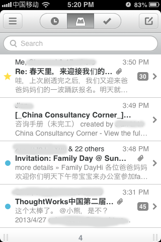
First, let’s design the User’s Journey in the Nanki App. As an impatient developer, why not copy some beautiful thing from others. The user experience of Mailbox is superb. Let’s see if we can achieve it with html, css and javascript.
We are going to build it with angularjs, so in the mailBox.html file, we declare it at the html tag as
<html ng-app="mail">1.
- ng-app can be put anywhere, e.g.
<body ng-app="mail">, as long as all the related directives are its decedeants.
Since we are going to use it on a mobile phone, add the following line to <head> section.
<meta name="viewport" content="initial-scale = 1.0,maximum-scale = 1.0"/>Add controller to body tag: <body ng-controller="MailController">
Html Layout
The body will be divided into 4 parts:
<div class="wrapper">
    <header class="clearfix"> ...
    <section class="search-bar"> ...
    <section class="container"> ...
    <footer class="clearfix"> ...
</div>
We will go through them one by one.
header
<header class="clearfix">
    <i class="menu icon-reorder"></i>
    <ul class="button-group">
        <li class="later icon-time"></li>
        <li class="inbox icon-inbox"></li>
        <li class="archive icon-ok"></li>
    </ul>
    <i class="edit icon-edit"></i>
</header>
clearfix
clearfix is used to fix the floating ‘issue’. We use float to move the ‘menu’ icon to the left and ‘edit’ icon to the
right. The same tech is used for the footer.
[http://stackoverflow.com/questions/8554043/what-is-clearfix] .
floatis meant to do stuff like float images next to long runs of text, but lots of people used it as their primary layout mechanism.
clearfix will add an element after and set clear: both for that element.
The content of clearfix as (scss or css) is:
.clearfix {
  *zoom: 1;
  &:before,&:after{
    display: table;
    line-height: 0;
    content: "";
  }
  &:after{
    clear: both;
  }
}
or
.clearfix {
  *zoom: 1;
}
.clearfix:before, .clearfix:after {
  display: table;
  line-height: 0;
  content: "";
}
.clearfix:after {
  clear: both;
}
icon-xxx
We use FontAwsome in this project. The class name icon-xxx can be put inside any tag.
Make sure the following line is added to the html file:
<link charset='utf-8' href='css/font-awesome.css' rel='stylesheet' type='text/css'/>-
buttons inside the group
    li {
      font-size: 16px;
      display: inline-block;
      padding: 5px 20px;
-
Add left border for each icon and remove the left border for the first icon late.
      border-left: $header-icon-border;
    }

    :first-child{
      border-left: none;
    }
  }

}
